
Các yêu cầu hoàn thành
The graph below shows the proportion of the population aged 65 and over between 1940 and 2040 in three different countries.
Summarise the information by selecting and reporting the main feature and make comparisons where relevant.
» Write at least 150 words.
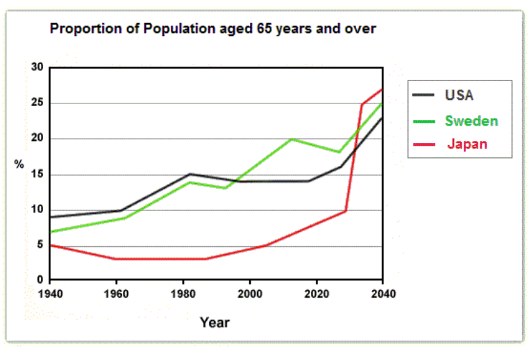
The line graph compares the percentage of people who are aged 65 and above in Japan, Sweden and the USA over a period of 100 years from 1940.
Overall, there will be a huge number of upwards in the proportion of elderly people in the three countries in the future.
In 1940, the percentage of three countries revealed almost the same results, the USA 9%, Sweden 7% and Japan 5%. In 1980, the number of elderly people in the USA increased gradually to 15% and this figure declined slightly to 14% in 2015. The number of people experienced a peak at 22% until 2040.
In contrast, The percentage of older people in Sweden climbed steadily to 20% in 2020. After 20 years, it will rocket to 25%. In 1960, Japan’s percentage declined minimally to 4% and stabled at this position in 1988. In Japan, the number of aged people saw a significant climb by 23 % over the given period of 52 years from 1980.
( 165 words )
Sửa lần cuối: Thứ Tư, 26 tháng 10 2022, 9:35 AM