
Các yêu cầu hoàn thành
You should spend about 20 minutes on this task.
The graphs below provide information on global population figures and figures for urban populations in different world regions.
Summarise the information by selecting and reporting the main features, and make comparisons where relevant.
Write at least 150 words.
 |
 |
|---|
Model Answer
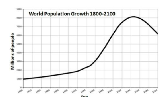
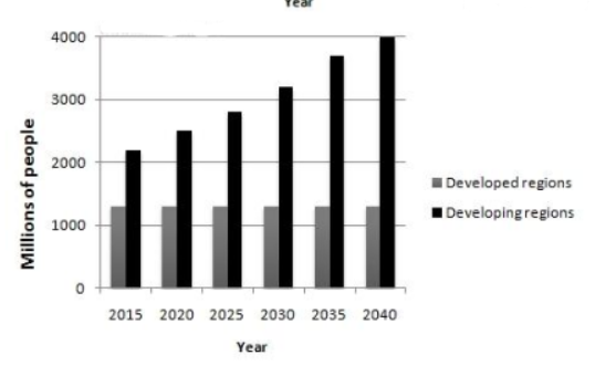
The first graph shows the trend in world population growth between 1800 and 2100, while the second graph represents the data of world urban population from 2005 to 2030. The general overview here is that, until now people has risen every year in the world.
Overall, it is clear that the global population growth will not occur evenly through out the world. While the population growth is greater in some regions than other regions.
Between the years 1800 and 1950 ,the population growth in world had a minor rise from 1 billion to 2.5 billion. After that, the graph had a drastic incline to exactly 6 billion people by the year 2000. However, the graph reached peak by the year 2030 with 9 billion people, then, the population growth across the world was unfortunately reduced to around 7 billion by 2100.
If we look at the population figures in different world regions, the graph illustrates that between 2005 and 2030, the figures had a minor rise from around 2 billion to 4 billion in developing regions. On the other hand, the urban population growth in developed regions remains steady at 1.3 billion.
Sửa lần cuối: Thứ Ba, 25 tháng 10 2022, 11:25 PM