
Các yêu cầu hoàn thành
You should spend about 20 minutes on this task.
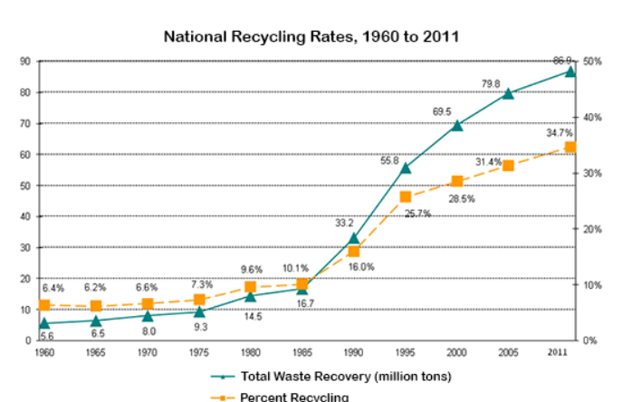
The graph below shows waste recycling rates in the U.S. from 1960 to 2011.
Summarise the information by selecting and reporting the main features, and make comparisons where relevant.
Write at least 150 words.
Model answer
The line graph reveals the percentage of waste being recycled from 1960 to 2011 percentages and the amount of waste recovery in tons.
Overall,it can be seen from the graph that the percentage of recycling remained relatively steady between 1960 and 1970. This figure rose gently over the next 15 years to 10.1% in 1985.
On the other hand, the amount of garbage tripled in the same period, from 5.6 million tons in 1970 to 16.7 million tons in 1985. Following this significant increase, the amount of waste material being recycled grew steadily between 1985 and 2011 when it peaked at 86.9 million tons.
Similarly, the recycling rate continued to grow sharply from 1985 to 1995, and then at a slower rate over the next 15 years until it reached the peak of 34.7% in 2011. However, this figure is still disappointing compared to the amount of waste being recycled each year.
Sửa lần cuối: Thứ Ba, 25 tháng 10 2022, 11:22 PM