
Các yêu cầu hoàn thành
You should spend about 20 minutes on this task.
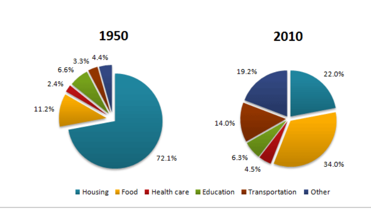
The pie charts below show the average household expenditures in a country in 1950 and 2010.
Summarise the information by selecting and reporting the main features, and make comparisons where relevant.
Write at least 150 words.
Model Answer
The pie charts reveal the information as to what households spend their money on services and goods over a 70-year period, it measured in percentages.
Overall, there was a significant increase in the proportion of the expenditure on other services and goods although housing recorded a slight fall in the proportion of household expenditure in the end of the period. It is noticeable that while the allowance for transportation was the highest percentage, food was by far the highest proportion on household expenditure over the period.
In 2010, the proportion of expenditure on food in the meantime was three times higher than that in 1960, it rose steadily from just over one in ten to nearly one in third, while the proportion of expenditure on the other needs and transportation was much higher in the end of the period than households spending on food, at 14% for transportation and nearly a fifth in 2010. In any case, the percentage of health care expenditure in 2010 increased twice as much as expenditure in 70 years ago.
Interestingly, from 1950 to 2010 experienced a slight fall in the percentage of housing, the figures stood at just under two-thirds in the beginning of the period, and then those dropped dramatically to 22%. In another case, the proportion of education remained unchanged over the period.
Sửa lần cuối: Thứ Sáu, 21 tháng 10 2022, 12:55 AM